Logic of Peek and Pop in 3D Touch
TL, DR
In 2015 Apple introduced 3D Touch. Before that there was already Force Touch on Apple Watch and MacBook Pro. Although both “touch” are techniques that make the touchscreen force-sensitive, 3D Touch on iPhone 6s / 7 are in a way of a higher dimension. 3D Touch is sensitive to continuous force changes, while Force Touch is discrete. With 3D Touch coming with new iOS devices, UIKit evolved too. A new way of interaction was introduced, which we’re going to talk about, that is, Peek and Pop.
Let’s see how Apple defined Peek and Pop in its official guidelines:
Peek and Pop let your users preview all kinds of content and even act on it — without having to actually open it. Users can then press a little deeper to Pop into content in your app. More specifically: You can now enable the view controllers in your app (instances of the UIViewController class) to respond to user presses of various intensities. As the user presses more deeply, interaction proceeds through three phases:
- Indication that content preview is available
- Display of the preview—known as a peek—with options to act on it directly—known as peek quick actions
- Optional navigation to the view shown in the preview—known as a pop
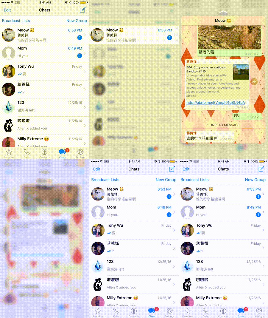
So basically Peek means a preview of the content, which you can easily tell by the word itself, and Pop means showing the full content on a new page. Seems pretty easy huh. What is there left to talk about since Apple’s guide has made it pretty clear? You may ask. What I’m talking about is a tiny detail in the logic. Let’s take WeChat and WhatsApp for example, WeChat being the bad one. We see a lot of UITableViews in iOS apps, and we tap on those UITableViewCells all day to see the detailViews. Like in an Instant Messaging app, we have a list of our chats with different people and when we tap on a cell the NavigationController navigates to the detail chat with that specific contact. Now we can 3D Touch on a cell to see the preview of the chat just like this:


If you’re careful enough you should’ve noticed the slight but major difference between how WeChat and WhatsApp handles data status in Peek and Pop:
You see we get a badge number in every cell if we have unread messages, indicating the user that he has unread messages:

And in WeChat, when we end a Peek gesture, the badge number disappears as if WeChat thinks we’ve already read the messages, while WhatsApp does not (You can see that in the gifs above).
This difference intrigued me to dig the details of Peek and Pop. Should app remove the badge number after a Peek?
Let’s see the Peek and Pop API:
func previewingContext(_ previewingContext: UIViewControllerPreviewing, viewControllerForLocation location: CGPoint) -> UIViewController?This function above is called when the user Peeks.
func previewingContext(_ previewingContext: UIViewControllerPreviewing, commit viewControllerToCommit: UIViewController)This function above is called when the user Pops.
The first function returns a UIViewController?, which means the app’s gonna show a view of the returned viewController as a preview. And when the user presses harder to pop in, the viewControllerToCommit gets pushed into the top of the viewControllers stack (or shown in any other way).
Apple’s official implementations of Peek and Pop in apps like Mail does not remove the badge number at all! Because Peek is designed to Peek. And Pop is when the user really sees the viewController and read the messages.
So WeChat’s implementations are kind of violating the guidelines and design logic of Peek and Pop by removing the badge number after a Peek action.
That’s all about the logic of Peek and Pop.
